Graphic kitchen
since 2014
Zedwell Hotels
Challenges
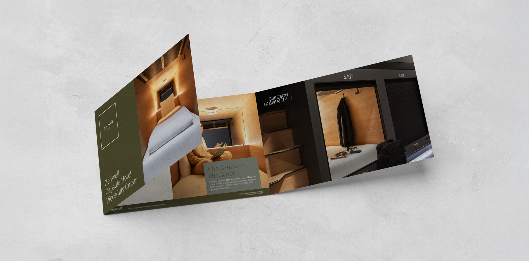
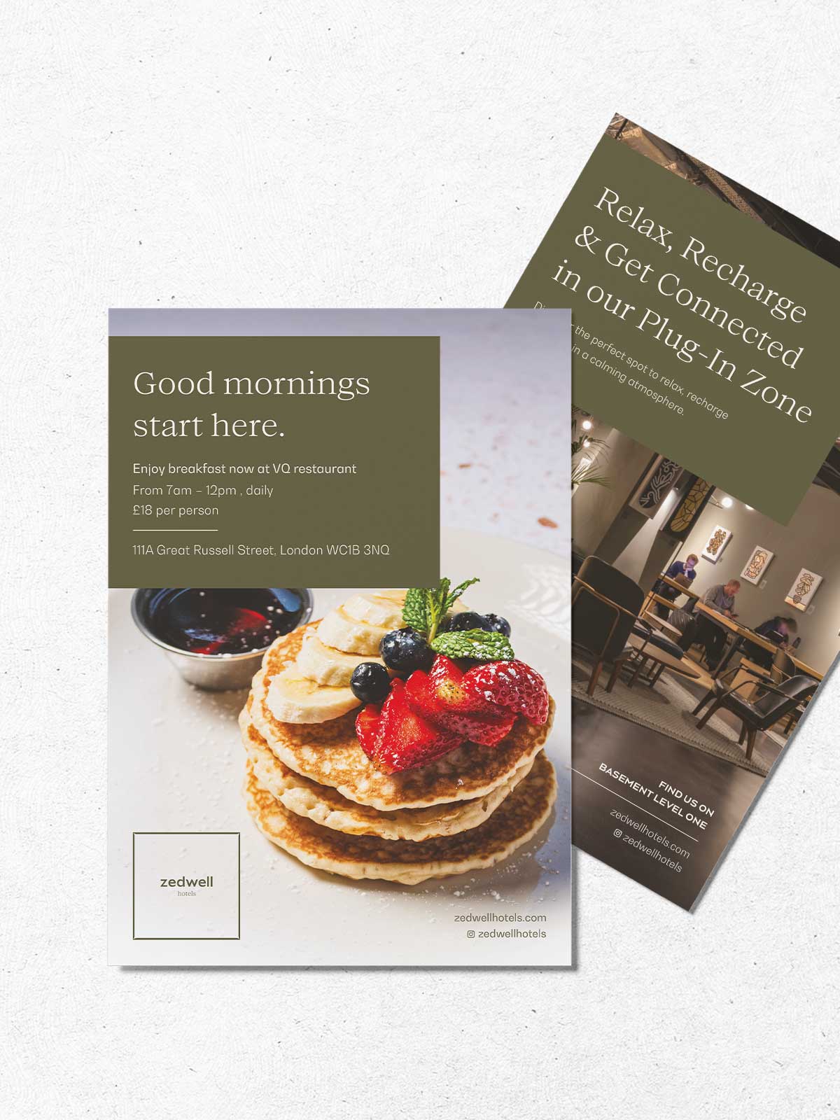
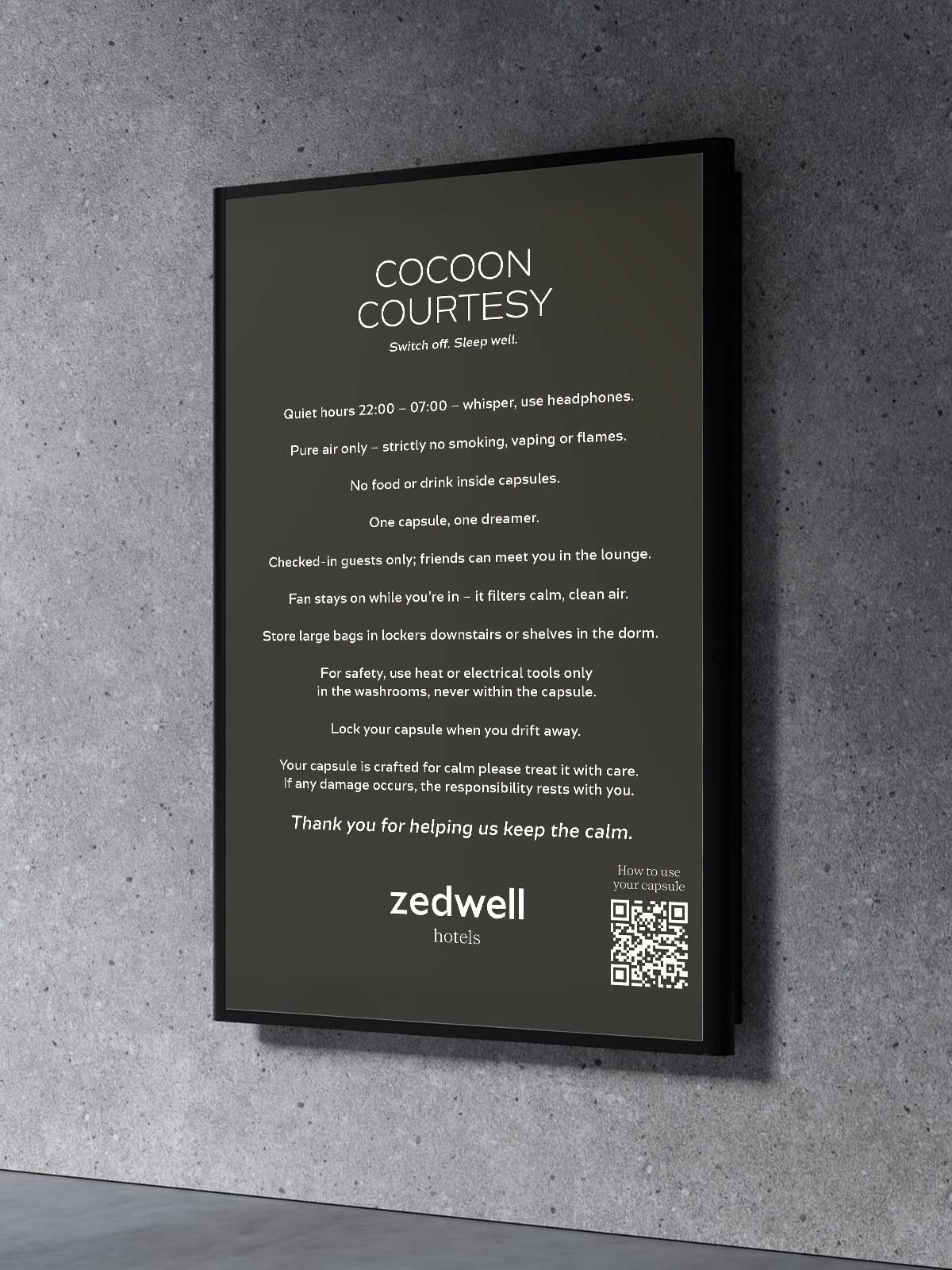
Zedwell Hotels was born from a simple but powerful idea: to create calm in the heart of the city. In a world of constant noise, movement, and stimulation, Zedwell offers a retreat where guests can breathe, reset, and recharge. Whether staying in a hotel room, capsule, or aparthotel, the experience is built around tranquillity, wellbeing, and intentional simplicity — designed to deliver deep rest in even the busiest urban locations.As the brand prepared to scale, it needed a cohesive and fully immersive identity system that extended far beyond a logo or colour palette. Zedwell’s ethos of calm living needed to be translated into every physical and digital touchpoint, from wayfinding and internal communications to external signage, guest literature, room collateral, brand guidelines, and corporate materials. The challenge was to bring clarity, consistency, and emotional resonance to a brand that exists across multiple property types and guest experiences within some of London’s most high-traffic areas.
Solution
We worked closely with the Zedwell team to deepen the expression of their calm-centric philosophy and ensure the brand was experienced with intention at every step of the guest journey. Our work began with refining and harmonising the brand language before expanding it into a comprehensive suite of visual and operational assets.From fully designed wayfinding systems to internal posters, outdoor advertising, guest room collateral, and corporate presentation packs, we created a unified visual identity that brought structure and serenity to the spaces. We also developed robust brand guidelines to ensure consistency across future locations and supported the rollout with cohesive messaging and design that mirrored the minimalist, restorative spirit of the Zedwell concept.Everything — from the typography to the tone of voice to the signage hierarchy — was engineered to reduce visual noise and enhance a feeling of calm. The result was a brand experience that not only supported the guest journey but also embodied Zedwell’s core purpose: creating pockets of stillness in the centre of the city.


Visual Hierarchy
Visual hierarchy is the principle of arranging elements to show their order of importance. information easily. By laying out elements logically designers working process by wireframing.
Components
From textile design to murals, editorial illustrations and book covers, her style is recognized by her simple and perfectly arranged shapes as well as her rich and vibrant color palette.