Graphic kitchen
since 2014
The Luxury Travel Club

Challenges
The Luxury Travel Club had a strong name, but the brand itself lacked clarity and direction. It felt tired, inconsistent, and was trying to appeal to too broad an audience — ultimately attracting the wrong type of customer. There was no clear positioning within the luxury travel market, making it difficult for the brand to stand out against other boutique agencies in an already saturated space.
Solution
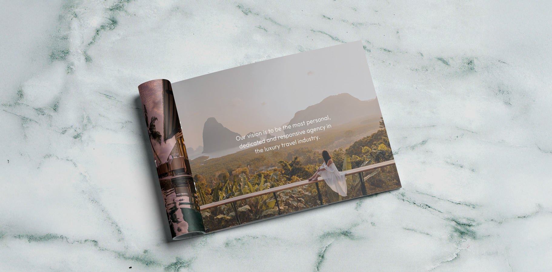
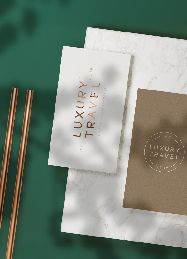
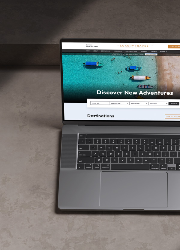
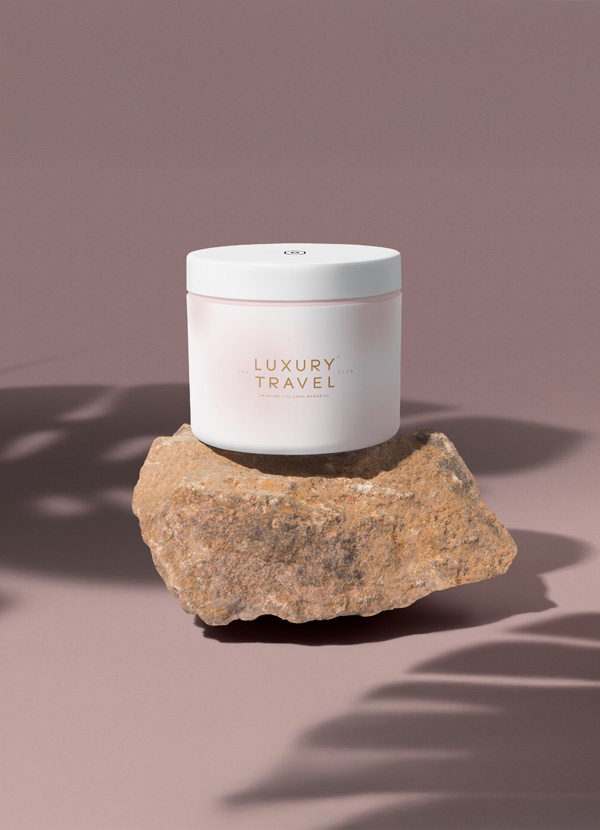
We started by running a brand workshop to define their target audience, refine their vision, and establish a clear strategic direction. From this foundation, we built a brand with precision — one that confidently positions The Luxury Travel Club within the luxury travel sector while clearly communicating their expertise and value. We developed a distinctive brand identity and crafted a strong, versatile brand mark that could be applied consistently across multiple touchpoints. This ensured the brand not only looked premium but functioned effectively across digital and physical platforms. The result is a cohesive, confident brand that reflects the level they operate at — giving them the tools to stand out, connect with the right audience, and continue growing from strength to strength.


Visual Hierarchy
Visual hierarchy is the principle of arranging elements to show their order of importance. information easily. By laying out elements logically designers working process by wireframing.
Components
From textile design to murals, editorial illustrations and book covers, her style is recognized by her simple and perfectly arranged shapes as well as her rich and vibrant color palette.