
.png)

Graphic kitchen
since 2014
Silver Palate
Challenges
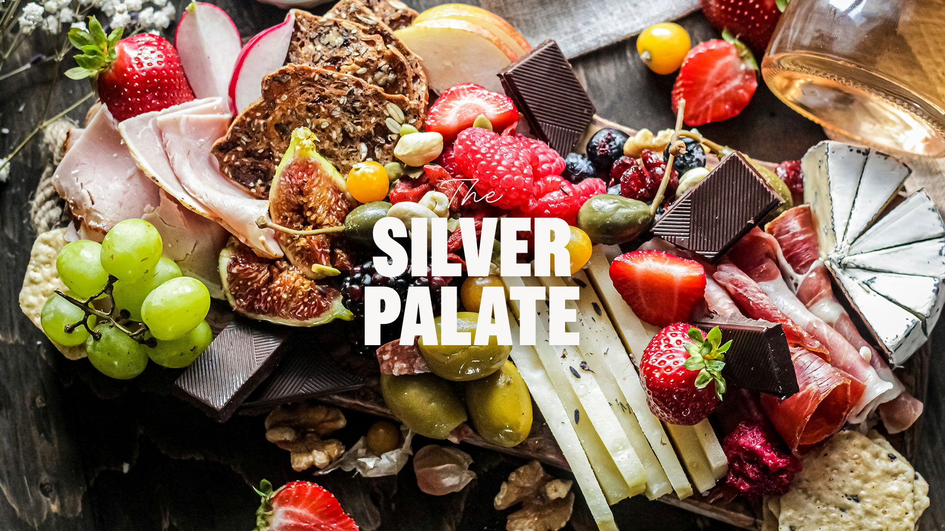
Silver Palate had built a strong reputation for delivering fresh, high-quality food across its cafés, corporate catering and retail offering. As the business expanded across multiple locations, the challenge was to create greater consistency across every customer touchpoint, ensuring the brand reflected the same quality, professionalism and attention to detail that guests experienced every day.
Solution
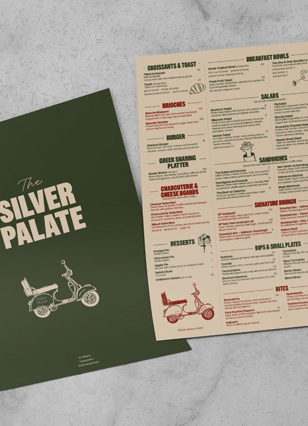
Working closely with the Silver Palate team, we developed a range of branded assets that strengthened the customer experience across every location. Our work included print menus, digital menu screens, catering brochures, branded coffee cups, outdoor signage, sandwich boards and a logo animation. Every touchpoint was designed to work together as part of a cohesive brand system, creating a more consistent visual identity that reinforces the quality of the business. The result is stronger brand recognition, an improved customer experience and a scalable brand platform that supports Silver Palate's continued growth.






































































Visual Hierarchy
Visual hierarchy is the principle of arranging elements to show their order of importance. information easily. By laying out elements logically designers working process by wireframing.
Components
From textile design to murals, editorial illustrations and book covers, her style is recognized by her simple and perfectly arranged shapes as well as her rich and vibrant color palette.