Graphic kitchen
since 2014
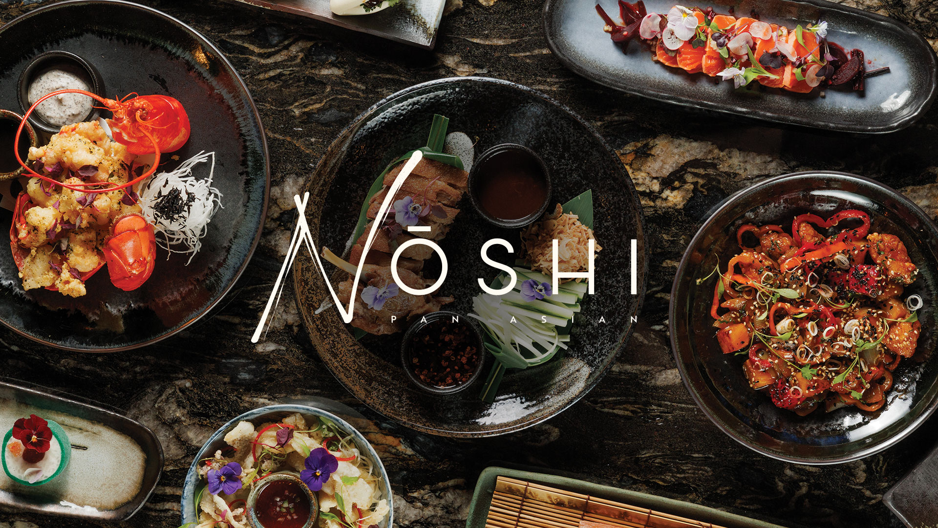
Noshi
Challenges
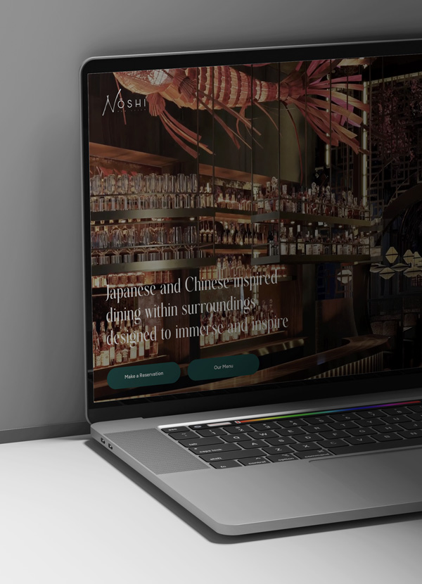
Noshi is a dining concept shaped by Japanese and Chinese inspiration — a story defined by balance, beauty, and intention. Built around the philosophy that memorable experiences come from harmony and detail, Noshi aims to create moments that stay with guests long after they leave. The vision was to deliver warm, attentive service; innovative, thoughtfully crafted dishes; bespoke seasonal cocktails; and an atmosphere where elegance feels effortless.The name Nōshi itself holds meaning: Nō represents skill and craftsmanship, while Shi — the Japanese word for four — symbolises balance and harmony. This draws on four traditional elements of beauty: Sabi (simplicity), Wabi (imperfection), Shibui (refinement), and Yugen (grace). These principles would guide the brand’s core pillars: food, drink, service, and surroundings.When Noshi first came to us, the idea existed only as a concept without a name, identity, strategy, or visual world. The founders needed a creative partner who could not only articulate the brand’s meaning, but also build it from the ground up — from naming and positioning to photography, PR, online presence, and a menu that would bring the entire vision together.
Solution
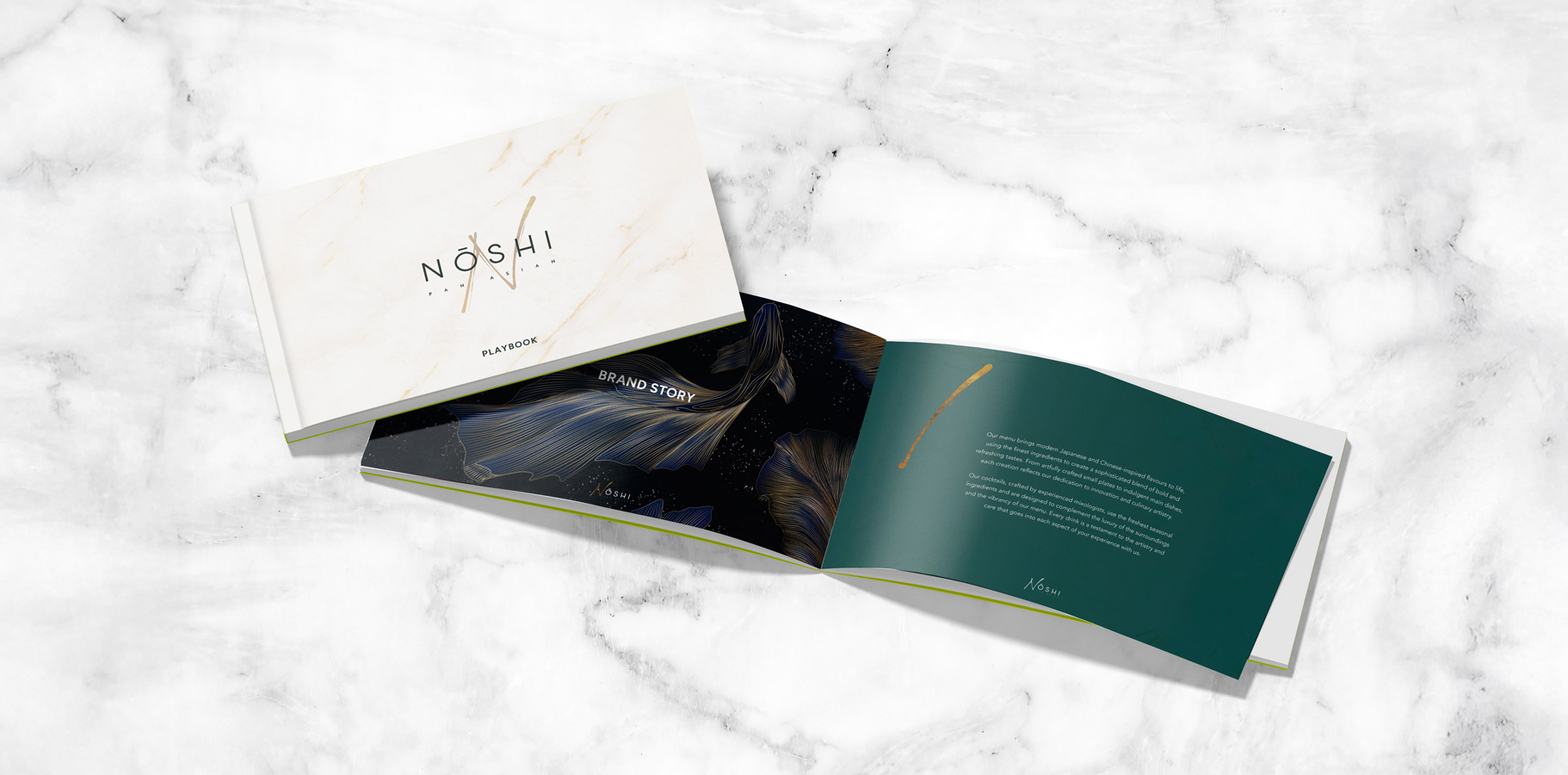
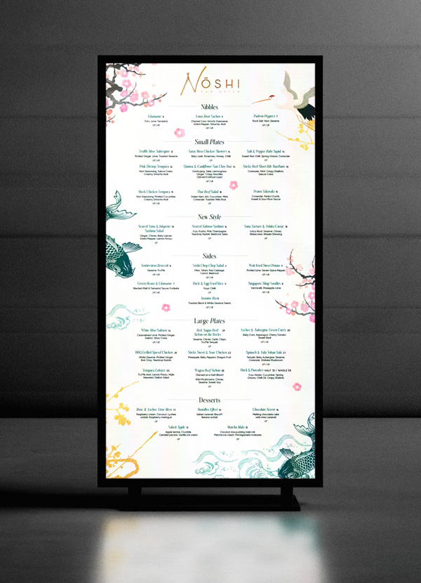
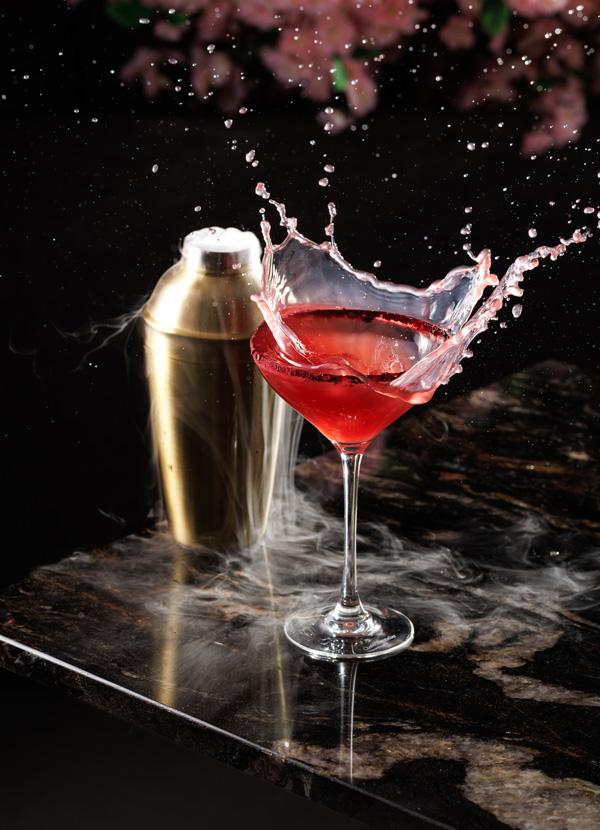
We began by exploring the brand's cultural roots, crafting a name and conceptual foundation that captured the elegance, balance, and artistry at the heart of the Noshi experience. From there, we built a complete brand strategy and visual identity, ensuring every element — tone of voice, colour palette, textures, patterns, and storytelling — aligned with the four principles that define Noshi’s ethos.With the foundation established, we curated a suite of food and cocktail photography that showcased the beauty and precision of the menu. We developed PR and communication materials to introduce the concept to the market with clarity and impact, and shaped Noshi’s online presence to reflect its elevated yet accessible personality. The menu became the signature piece that tied everything together — designed to express the brand’s philosophy while guiding guests through a seamless, engaging culinary journey.Through this holistic approach, we transformed an initial idea into a fully realised brand ready to launch with confidence and coherence — a dining destination where beauty, craft, and creativity intertwine.


Visual Hierarchy
Visual hierarchy is the principle of arranging elements to show their order of importance. information easily. By laying out elements logically designers working process by wireframing.
Components
From textile design to murals, editorial illustrations and book covers, her style is recognized by her simple and perfectly arranged shapes as well as her rich and vibrant color palette.