Graphic kitchen
since 2014
Dojo Restaurant
Challenges
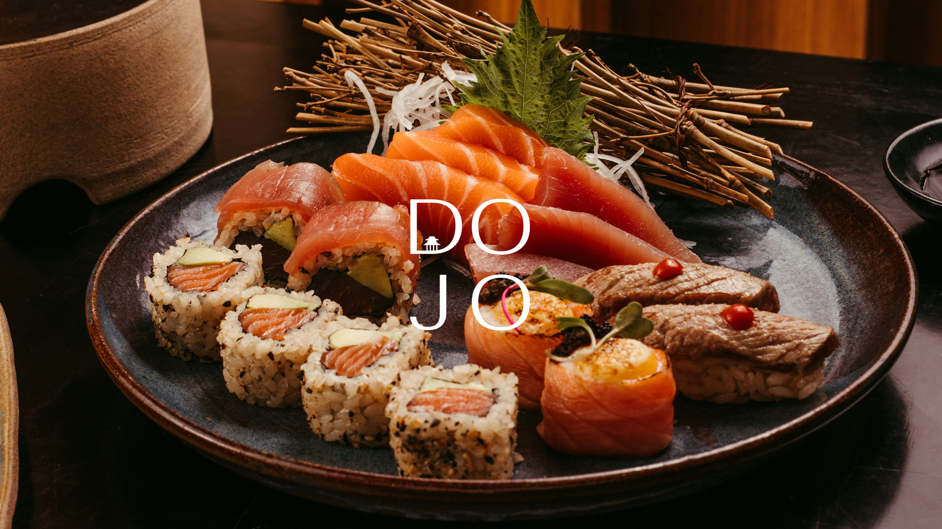
DOJO is a popular Pan-Asian restaurant, bar and lounge in Hatch End, offering a vibrant dining experience that combines authentic Asian flavours with contemporary sophistication. From signature sushi and Pan-Asian dishes to creative cocktails and its distinctive Garden Lounge, DOJO has established a strong identity built around food, atmosphere and guest experience. However, despite the strength of the concept, its existing menus weren't reflecting the quality or personality of the brand. The menus lacked clear structure, visual hierarchy and a cohesive connection to the restaurant's interiors, digital presence and cocktail presentation. This created a disconnect in the guest journey and missed opportunities to showcase signature dishes, promote premium drinks and encourage additional spending. The challenge was to transform the menus into commercially effective tools that would complement the DOJO experience, make ordering more intuitive and support greater revenue potential.
Solution
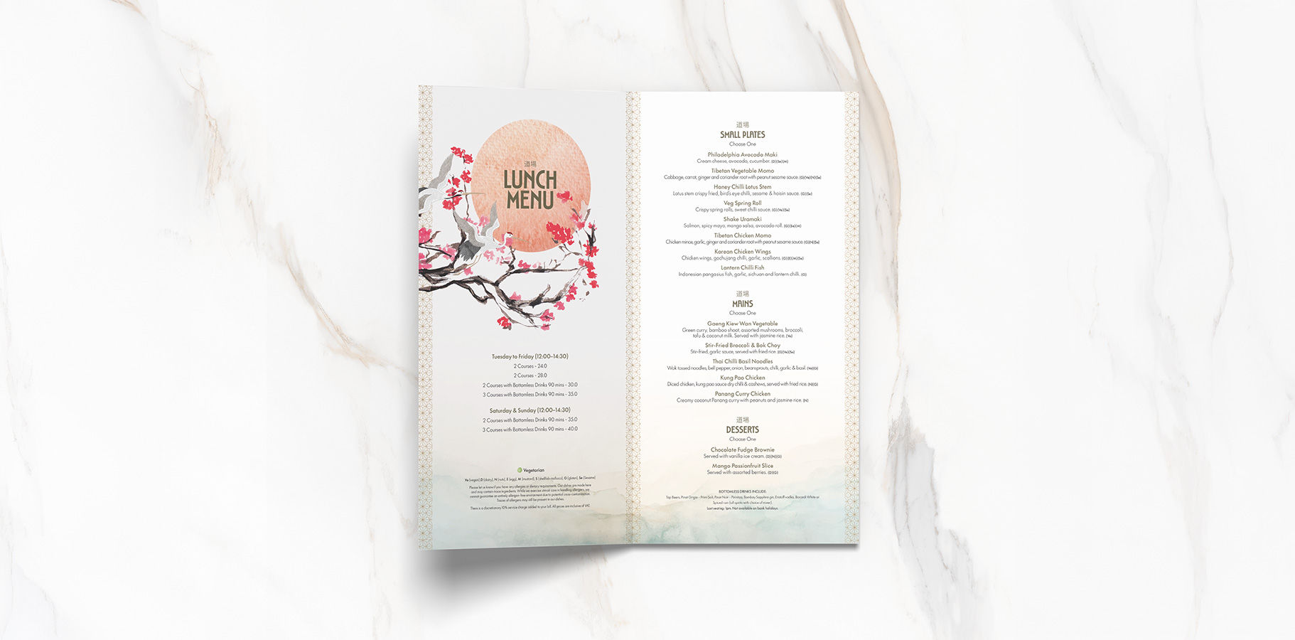
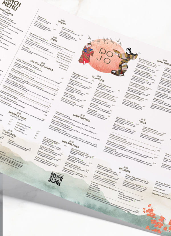
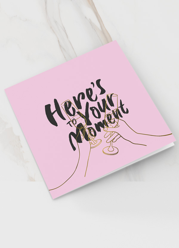
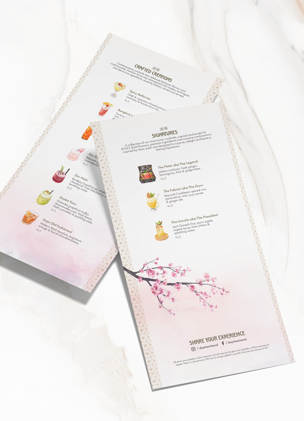
We approached the project with a combination of creative design, menu architecture and commercial thinking. Starting with a review of the existing menus, we restructured the content to create a more logical flow, improve readability and establish a clearer visual hierarchy. This allowed us to give greater prominence to signature dishes, premium offerings and key menu categories, helping guests navigate the extensive Pan-Asian selection with greater confidence. We developed a distinctive design direction that connected the menus with DOJO's sophisticated interiors, contemporary personality and overall brand experience. For the drinks menu, we created bespoke cocktail illustrations that celebrated the creativity and presentation of DOJO's cocktail offering. These illustrations added visual interest and personality while helping guests explore the drinks selection and encouraging opportunities for upselling. Every design decision was considered from both a guest experience and commercial perspective, balancing visual appeal with functionality and ease of use. The result was a cohesive suite of menus that better reflected DOJO's brand positioning, enhanced the ordering experience and created a stronger platform for increasing average guest spend. A menu designed to do more than look good. A menu designed to perform.



































































Visual Hierarchy
Visual hierarchy is the principle of arranging elements to show their order of importance. information easily. By laying out elements logically designers working process by wireframing.
Components
From textile design to murals, editorial illustrations and book covers, her style is recognized by her simple and perfectly arranged shapes as well as her rich and vibrant color palette.